

After some delays, the newest major update to Windows 10, the April 2018 Update, has just scraped into April. It's available to download right now and will start distribution on Windows Update on May 8th.
Even with its extended development period—a blue screen of death crash was discovered late in the process, forcing Microsoft to delay the release by a few weeks—the new release feels very similar to its predecessor. While the last couple of updates have tried to push new directions—virtual and augmented reality in the Fall Creators Update, 3D graphics in the Creators Update—with Microsoft trying to promote them as being themed collections of features gathered together, the new update doesn't have any particular overarching theme. Instead, it's a bunch of improvements to various parts of Windows, along with one particularly notable new feature.
That big new feature is one that we thought we were going to get in the Fall Creators Update: Timeline. Timeline adds a new dimension to the Windows task switcher (the one shown when you press Win+Tab or click the "Task view" button on the taskbar): specifically, time. The default view when you first enter the switcher is the same as it ever was, showing all the windows you have open so that you can instantly pick between them. But it now has a scrollbar. Scroll the screen down and you'll see historic documents, browser tabs, and applications.
If Timeline just showed things you have open on your PC, it would be handy. But it goes further than that: if you use Edge on your Android or iOS phone, tabs opened in the mobile browser are also visible on the desktop Timeline. I find this very useful—it's a convenient way of taking what I was doing when mobile and picking it up on my PC.
The main view of running applications hasn't changed a lot. Scroll down and you can see documents and websites that you've been using previously. Drill into a single day and you'll see an hour-by-hour breakdown of your activity.
The selection of things visible in Timeline is perhaps its weakness. Applications that use Windows' standard APIs for most recently used files seem to show their documents within the Timeline. Edge tabs all seem to be visible, too. But I use Chrome as my primary browser, and Chrome's tabs don't appear to be tracked in Timeline. That's not to say Chrome doesn't appear at all, though. Here's the way I think it works: if I click a link in a different application and that launches a Chrome tab, that link is put in my Timeline. If, however, I create a new tab within Chrome directly by pressing ctrl+T, Timeline has no idea.
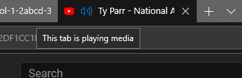
Better integration with Timeline is almost enough to make me want to switch to Edge. Microsoft continues to make Edge better; the browser has the usual updates like better standards compliance and performance, along with a handful of user improvements. The most thoughtful and useful improvement for me is the indicator that a tab is making sound. Showing a little loudspeaker icon on a tab is nothing special itself, but Microsoft has gone further than other browsers: the loudspeaker is clickable to toggle muting of the tab. Clicking the speaker icon on the tab mutes the tab without even switching to the tab. This kind of thing is so obvious but so handy: I often have a YouTube tab in the background playing a playlist, and making it quicker and easier to silence that tab for a phone call or to talk to my wife is smart.
The biggest invisible change is likely the support for Progressive Web Apps (PWAs), the latest trend in Web-app development that closes a lot of the gaps that exist between rich websites and "real" applications. PWAs can do things like send notifications even when they're not open in a tab. They're a little thin on the ground at the moment (the Mobile Twitter site is one of the more useful), but with backing from both Microsoft and Google, they seem likely to proliferate.
The reason I don't switch to Edge? Its tab management is still weaker than Chrome's. I have multiple Chrome windows, each with its own sets of pinned tabs. Chrome properly preserves these across browser sessions; Edge doesn't seem to be able to. For me, that's a dealbreaker.
The "Quiet hours" feature from previous versions has been updated and renamed to "Focus assist." The idea is still the same—at night, you don't want the noise of notifications, so the feature lets you turn them off at certain times of day—but it's now considerably more flexible. For example, your laptop can now be specified to hide notifications whenever you're at home, and full screen DirectX games can also automatically suppress notifications.
This is a step toward usefulness; I just wish Chrome respected the setting (but this would probably mean using system notifications rather than its own bespoke notification windows). I also wish that borderless windowed games using OpenGL, Vulkan, or DirectX could automatically enabled focused mode—I never play games with traditional full screen.
The layout of the main Settings page has been slightly rejigged. And if you drill down into a setting, the left hand panel is now translucent. Fonts are now managed in the Settings app, too. Fonts can be bought and installed through the Store. Individual applications can now be directed to use specific audio devices. Focus assist can detect at least some games and disable notifications when they're being played.
Beyond these features, Windows 10 continues to feel very transitional. Microsoft is adopting its Fluent Design in an incremental, piecemeal fashion. The Settings app has been updated to include the translucency and mouse hot-tracking effects that Fluent brings, for example. So too does the Start menu. But the design is still not being used everywhere, and other elements that Fluent includes, such as the greater use of animations, are still rare.
Similarly transitional is Settings; with each Windows update Microsoft is adding more and more settings to the Settings app, eliminating the need for the old Control Panel. Fonts, for example, are now in the Settings app, and Fonts can now even be installed from the Microsoft Store.
Mixed in with this are new features. Sound settings are now found in the Settings app (at least in part), and with that, there's a new ability to direct different applications to different sound devices. This is invaluable for applications that don't offer this kind of control themselves.
The progress is welcome, though it's already showing some of the same problems as the Control Panel of old. In particular, the categorization that Settings uses feels a bit arbitrary in certain areas. Why is Focus assist a "System" setting, for example? Overall, the Settings app looks and feels better than Control Panel, but Control Panel hasn't gone away yet, and it's still required for some options.
Windows 10 continues to be a work in progress
Another transition that's much less welcome, at least for me, concerns Cortana. Microsoft is moving certain Cortana features to the Activity Center: instead of putting Cortana stuff in the Cortana panel, the virtual assistant will proactively send notifications (telling you, for example, about packages that are being tracked, or when to leave to get to your next meeting), with a view to turning the Cortana panel into more of a conversational interface, similar to that of Google's assistant. But this means that the old Cortana pane, which would give you an at-a-glance view of the day ahead, is gone.
The April 2018 update continues the trend of making Windows 10 better. There are neat new features like Timeline, behind-the-scenes work like less downtime for updates, and the continuing transition to the modern Settings app and Fluent design. This update feels like less of an "event" than past ones—the prosaic name and lack of big reveal event being quite a contrast to the previous updates—but that feels like a good thing to me. Making these updates seem less significant (and hence less daunting to both consumers and enterprises when it comes to installing them) should result in quicker adoption.
The concern, however, is bugs. The build has worked well enough for me and doesn't seem egregiously buggy, but in comments and forums (and oh goodness, the emails I get) I've been seeing growing complaints of increased bugginess. Bugs that have been reported are going unfixed across multiple updates, with some saying they've been forced to stick with previous updates to avoid them. Microsoft is developing Windows 10 in a different style than it used to use, which is why it's able to make these periodic feature updates. The feature updates are very welcome—exciting new things such as the Windows Subsystem for Linux were introduced in one such update, for example—but there's still work to do if Redmond wants to convince every Windows user that the quality is what it should be.
[contf] [contfnew] 
Ars Technica
[contfnewc] [contfnewc]


